
Paperback Reader

Whenever I remind one of my friends that I'm a writer, he mockingly sings the lyrics of "Paperback Writer".
But lately, I've been more of a paperback reader, specifically novels by other indie authors. Although I do have a Kindle (somewhere in a box in my home office. I haven't lost it, I just have no idea where it is), I like to highlight passages and furiously scribble notes in the margins.
Many of these indie paperbacks end up breaking what I regard as conventional formatting rules.
Now if you know me, you know that I'm 100% in favor of smashing conventional rules into sand-sized particles that can be tossed into Galveston Bay and never seen again. And I'm not some great authority on the matter, I merely have my own observations.
Still, it seems like there should be a list of these unspoken rules in case you want to follow them. Or deliberately break them.
Choose a Trim Size by Genre
Generally it's a good idea to look at popular books in your genre when choosing your book's trim size.
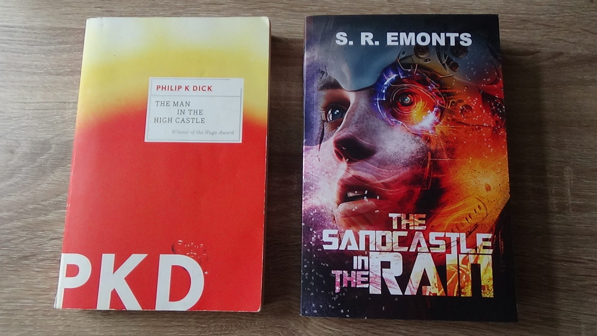
For example, I grabbed my copy of The Man in the High Castle and measured it when choosing the trim size for my novel.
Another factor is your word count, since more words can fit on more smaller pages or fewer larger pages (I tried saying that five times fast and failed).
Exceptions For Large Trim Sizes
Sometimes I've seen nonfiction books use very large trim sizes even though the page count isn't excessive. A friend of mine, who is an adjunct professor, told me that those sizes are chosen so students can stack them with textbooks.
Large trim sizes are also common for children's books since they're often picture books.
Choose the Right Color Paper
The general rule is that fiction should be printed on cream-colored paper and nonfiction on white-colored paper.
Some fonts look better on white as opposed to cream, so with the right font, it can still look good.
Cream-colored paper is not only different in color from white, but the thickness and texture are different. In fact, the type of paper you select affects the book cover templates due to the difference in the paperback's final thickness.
It's worth noting that some POD printing services won't let you change your book's paper color after you've selected it. As the knight says in Indiana Jones and the Last Crusade, "You must choose. But choose wisely."
Choose a Great Font
In The Lost Interview Steve Jobs tells a story (among many) about how his time at Reed College impacted the computer industry.
One of the courses Steve took was on calligraphy and its usage in writing and typesetting. When he co-founded Apple Computer years later, he introduced the concept and functionality into personal computers. Today, we have far more fonts available to us than the early Macintosh computers supported.
I'm not a lawyer (so this isn't legal advice), but some fonts are subject to different licensing depending on personal or commercial use. Some information I've found online indicates that some of this licensing actually applies to redistributing the font files and not their usage in printing a book (but again, I'm not a lawyer).
Lately I've been browsing Google Fonts. Many of them are explicitly free for commercial use.
One thing to consider is how the font looks on the paper you intend to use. Fonts that look good on Kindle or are commonly chosen for office emails are generally suited well for white backgrounds/white paper.
Writing is a creative process, so I recommend choosing a font that expresses yourself and your work.
Margins and Tab Size
POD services have guidelines for minimum or suggested margins for your chosen trim size. The convention for outside margins is 1/2" or 5/8".
Most word processors default to 0.5" tabs, but books normally shorten this to 0.25".
Justify the Text, or Justify Why You Didn't
I'm currently reading an indie novel where the text wasn't justified, and the author told me a writing template left-aligned his manuscript by default.
Templates! After filling the atmosphere with enough profanity to fill a dozen balloons, I gave up on templates.
Most word processors will allow you to create a text style or modify the default paragraph style alignment. Just be forewarned that changing styles can sometimes affect more text than you think (you can never have too many backups of your novel).
One consideration is hyphenation. When text is justified, lines can sometimes be stretched out to fit the available space. The result is something that looks rather clunky. Microsoft Word has an auto-hyphenation feature, though it should be noted that this can lead to so many hyphens that most paragraphs look rather unseemly. This feature is configurable, admittedly beyond my ability to comprehend. Some line editors offer a formatting service if you'd like this done manually.
In an early draft of my novel, I had entire paragraphs aligned left and right as a character underwent a psychotic break from reality. But most beta readers didn't like it.
Unique Styles and Formatting
In some novels, writers format sentences and entire paragraphs differently from the rest of the text. This could be used to emphasize a unique narrative device, such as a narrator or a news broadcast the POV character watches. I used a different style of text when characters used a keyboard.
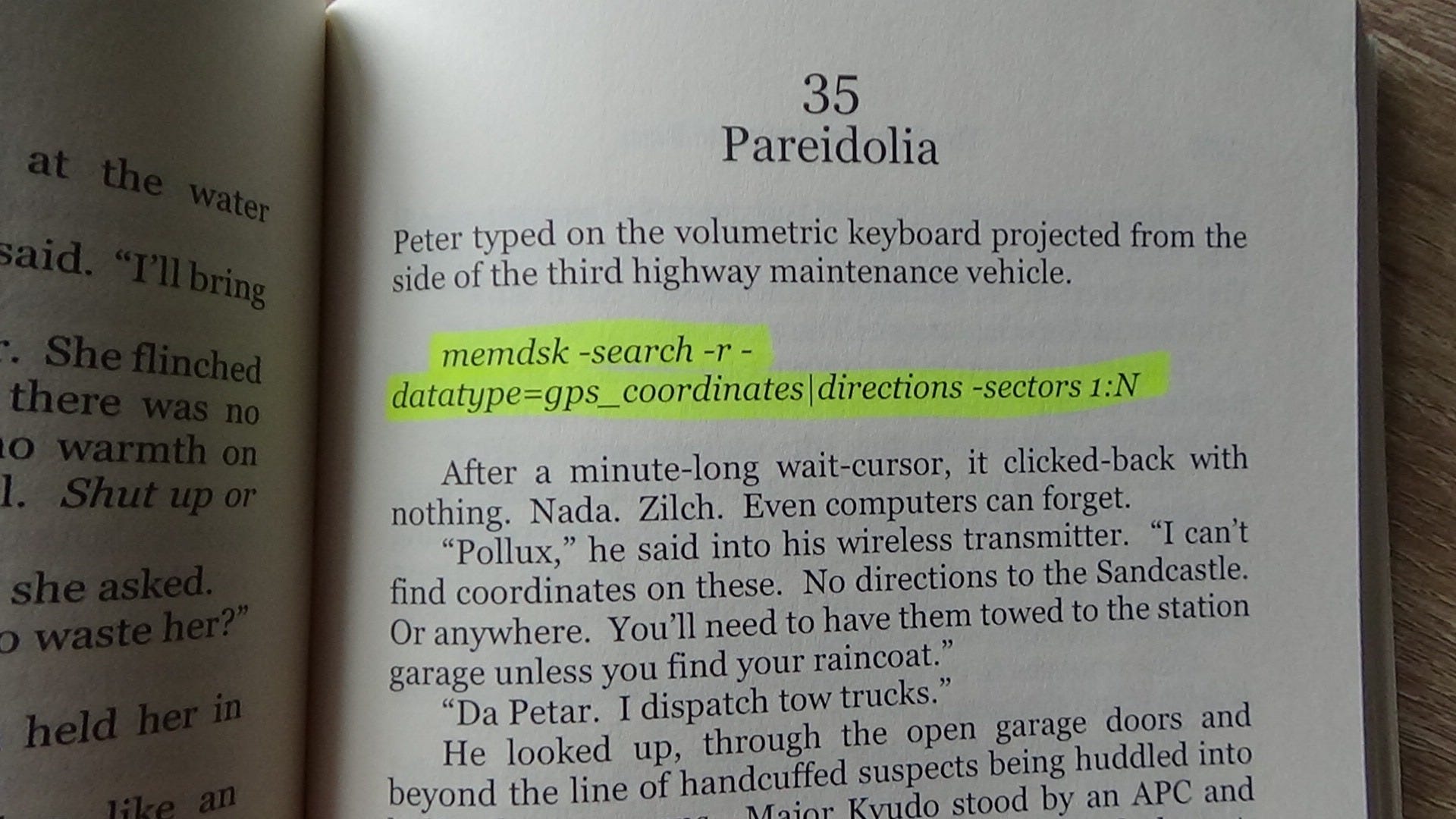
If this text is going to be consistently formatted in italics, it could make sense to create a specific style for this in your word processor, and those lines can be aligned differently than the rest of the text.
Headers, Footers, and Page Numbers Oh My!
Page numbers are often either in the header or footer, unless you're Haruki Muramaki writing IQ84 and you put them in the margins and reverse them at the halfway point.
Most word processors allow you to specify different headers for even and odd pages. Having the book title on one side and the author name or current chapter on the other is common. If page numbers are in a header, a border-less table can align it.
I put page numbers in the header because the current chapter number and name are there too, with the reasoning that if the reader is trying to find a specific page, all of the information is in one spot instead of being split with a footer.
To Table of Contents, Or Not, That is the Question
Ebooks generally have a table of contents. In fact, KDP's fine print (last I checked) requires one. Presumably this is because a reader might pick up your book on a different platform or device, requiring them to navigate to the last chapter they read.
Most word processors provide a way to automatically create a table of contents based upon the headers you've (hopefully) set up for each chapter.
For nonfiction, a table of contents allows the reader to refer to a specific topic, so adding one is sensible.
But for a fictional paperback, the answer is less clear. Unlike an ebook, it's easier with a paperback to simply use a bookmark or a recent HEB receipt for people like me who are too cheap "financially conscientious" to spend money on bookmarks.
One consideration is genre. For my cyberpunk noir novel, some readers told me they wished they could refer to earlier chapters to piece together mysterious plot elements. I've often wondered if a table of contents would have helped. On the other hand, are your chapters only numbered or titled too? Do the chapter titles build anticipation if the reader sees them before page 1? Do they spoil any plot twists?
Like most writing choices, it helps to ask how a reader will read your novel and whether something like a table of contents will be used by them. Or will it only be more pages separating them from chapter 1?
Do Whatever You Want
I'm not an expert, so I make no claims of this being comprehensive, but I do hope this list will help someone if they need a starting point for formatting their book.
And despite any conventions or trends, writing is art. I hope you express yourself and write the book you want.
This is all great advice—especially making sure you get your paper color right, as KDP does not let you change that after you hit publish.
Some older fiction books have a table of contents. Newer fiction print books tend to omit them. So if you're comparing your book to one on your shelf, you should probably use a newer work to keep up with trends.
If you format with KDP's Kindle Create (free), it should automatically justify the text and hyphenate, as well as adjust the margins for you. You're stuck with their font. It'll also let you choose a few design elements like chapter header style and page number location. You have to adjust line spacing to fix your windows and orphans.
Draft2Digital also formats for free and offers more choices for chapter designs. They will get rid of orphans and windows for you (you can set how many lines can get cut off onto their own page and it'll automatically carry it through your book).
Both Kindle Create and D2D will get your margins right for you, taking out the calculations and guess work there.